Variable Diffusion of Cardiovascular Disease along the I-20 Corridor in Texas_Juniper Publishers
CURRENT RESEARCH IN DIABETES & OBESITY JOURNAL JUNIPER PUBLISHERS
Authored by
Mario A Pitalua Rodriguez
Abstract
Background and Objective: Visualization enables researchers to view variable diffusion spatially to pinpoint geographic areas of interest for further investigation, particularly with big or large amounts of data. Without the ability to visualize large amounts of data concerning diseases, such as CVD, important relationships may be missed that could have the potential of affecting public health policy and practice.
Material and Methods: A subset of 60 variables previously reported as related to CVD is utilized for the at-risk population of CVD at the county level in the United States. CVD indicators across a geographical space (i.e., an Interstate highway in this study) expose differing levels of factors through areas of small and large populations.
Results: The visual representation simplifies and summarizes the data allowing identification of places and the factors considered for an intervention. In addition, visualizing allows patterns to be discovered, variable dimensionality reduction, and ranking of variable importance. Observations show 15 variables can be considered for removal from the 60-variable set, since they have smooth diffusion patterns, or nearly constant values across the geographical places in question. The remaining variables can be further analyzed and reduced based on characteristics of their sharp diffusion pattern.
Conclusion: Visualization by variable diffusion is an effective technique that rapidly provides insight regarding variables of interest in a geographical area. The impact of our analysis has the potential for allowing identification of critical points of disease clusters that would benefit from strategically-placed interventions to help at-risk populations.
Keywords: Cardiovascular disease; Obesity; Visualizations; New method; Diffusion
Abbreviations: CDC: Center for Disease Control; CVD: Cardiovascular Disease; FIPS: Federal Information Processing Standards; BRFSS: Behavioral Risk Factor Surveillance System; USDA: United States Department of Agriculture; BLS: Bureau of Labor Statistics
Introduction
Obesity, diabetes, and cardiovascular disease (CVD) are the triad of lifestyle diseases creating a costly constellation of comorbidities leading to poor health outcomes and increased health expenditures. Co-morbid complications from obesity and diabetes have been previously found to impact CVD [1-3]. Co- morbid diseases such as hyperlipidemia and hypertension not being controlled with medication have also been linked to CVD [4]. The links between co-morbid diseases, unhealthy lifestyles and obesity, diabetes, and CVD are complex and difficult to attribute causation to individual factors [5]. Pathways to and from disease manifestation are multimodal with factors acting at many different levels across the life course. Further complicating the situation are unknown connections between multi-level factors that are potentially associated with each other and with the development of poor health. Environmental and policy factors stand out among the unknowns as they are pervasive, yet their effects are not well studied. To understand how to mitigate poor health from this triad of diseases, we need to understand the multifactorial components rooted in both temporal and spatial contexts in an individual's life course. Advanced statistical analysis, however, is difficult, time consuming and many times leads to ambiguous findings that do not easily translate into interventions [6].
To illuminate connections among multilevel factors, a simpler method may be effective. For example, visualization can aid understanding of data by leveraging the human visual system's highly tuned ability to see patterns, spot trends, and identify outliers [7]. A well-designed visual representation can replace calculations (possibly complex analysis) with simple perceptual inferences. Visualization of diffusion of ideas, chemicals and innovation is not new [8], however, it appears that unhealthy lifestyles diffuse through social networks [9] to create CVD [10], obesity [11], and diabetes [12]. Thus, if the disease diffuses through social networks, then would the factors that caused the disease also have similar diffusion patterns? The purpose of our study is to test the feasibility of utilizing a simple graphical method to identify constellations of factors contributing to CVD that potentially lend themselves to intervention across geographic regions.
Methods
Data
Data, collected for counties along Interstate-20 in Texas, are from the Center for Disease Control Wonder Health Data [13], Center for Disease Control Behavioral Risk Factor Surveillance System (BFRSS) [14], the U.S. Census and Bureau of Labor Statistics (Census and BLS) [15], and the United States Department of Agriculture Food Atlas (USDA) [16]. Environmental variables also obtained from the CDC WONDER include: the number of cardiovascular deaths per county which was converted to percent CVD deaths in each county (CVD death rate]. Average daily surface land temperature and fine particulate matter. Daily surface land temperature is an average temperature measurement in Fahrenheit of how the surface of the earth feels to the touch. Fine particulate matter is a measurement of airborne pollutants individuals breathe. Health lifestyle choice variables were obtained from the BRFSS database and include average county smoking rates and obesity rates. Average County smoking rates were estimated by the BRFSs with the average rate from 1996-2000 being used. Average obesity rates were estimated for 2004 in the BRFSS. Socioeconomic predictor variables obtained from the Census data at the county level include: average age, unemployment rate, per 1,000 fast food restaurants, per 1,000 full service restaurants, median household income, population density, and social security recipients. Data for the year 2000 includes: average age of individuals in a county measured in years, unemployment rates is of the civilian labor force, rate of restaurants per 1,000 residents (classification into full service vs fast food is based on the businesses' North American Industrial Service Classification designation), median household income in dollars, population density per square mile, and the number of social security benefits. Food environment atlas data are aggregated by regions with 26 markets and 9 metro regions. Based on the USDA economic research service, estimates of average pounds purchased per year of meat and packaged sweet snack foods including cookies and candy bars were included. The data was combined and coded at the county level using Federal Information Processing Standards (FIPS) codes. Confirmation of accurate compilation was checked by running frequencies on missing data to ensure the data was correctly merged.
Analysis
To visualize variables, the data is represented by quintiles computed with nationwide data. The highest group is labeled 'A' that includes 80.1% to 100.0%. The subsequent groups are labeled 'B', 'C', 'D', and 'E' (with 'E' being the lowest group from 0.1% to 20.0%). Analysis of variable diffusion is done by focusing on counties along Interstate-20 in the state of Texas. A first visualization is done by building a table with the variables in question as rows and columns representing geographic regions (i.e., counties from West to East). Quintile labels are used instead of numbers and cells are color coded for each quintile. From the table, boundaries can be determined between the geographical regions. A boundary is encountered at the border of two geographical regions. Diffusion can happen at each boundary. The diffusion at the boundary between region A and region B is the difference between its values (quintiles). For instance, If region one is a value in quintile 'A' and region two is a value in quintile 'E', the difference is 4. Four is the maximum boundary diffusion possible. For any variable, the sum of the diffusion values at each boundary from West to East represents accumulated variable diffusion. It is denoted by the equation.

where 'v' is the variable in consideration, and 'b' is the next boundary from West to East. All the variables can then be sorted out based on their accumulated variable diffusion.
Visualization and interpretation
Variable Diffusion is defined as the effect of one variable across a geographical region (i.e. county). Two kinds of diffusion are expected. The first is smooth diffusion in which a quintile change of one at a boundary exists (e.g, 'B' to 'C'). The other is sharp diffusion in which the quintile changes by a factor of two or more at one boundary (e.g., 'D' to 'A').The pattern of any variable can be represented by a series of diffusions from West to East. All variable diffusion patterns can be graphed and then visually compared to the CVD variable. The variable pattern of diffusion is summed across each boundary. For example, if the first region is on quintile 'A', and the next region is on quintile 'C', the diffusion between these two regions is two. When adding a new region to the east that is on quintile 'B', the diffusion between the last region and the new is one. The series of diffusion values is now (2, 1, ..., n). The maximal diffusion possible when the data is represented by quintiles is 4. If both regions are on the same quintile, the diffusion is zero meaning no diffusion.
Results
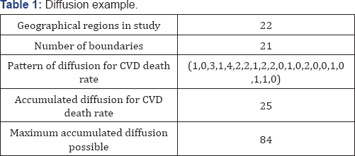
Table 1 displays the pattern of diffusion for the CVD death rate which is represented by the sequence (1, 0, 3, 1, 4, 2, 2, 1, 2, 2, 0, 1,? 0, 2, 0, 0, 1, 0, 1, 1, 0) with the accumulated diffusion sum being 25. Since there are 21 boundaries in the study, (from 22 geographical regions along I-20 in Texas), the Maximum Accumulated Diffusion possible for any variable is 84, resulting from the product of 21 boundaries times four. Dividing the accumulated diffusion for CVD death rate (25) by the Maximum Variable Diffusion possible (84) gives us, the diffusion ratio for CVD death rate as 29.76%.

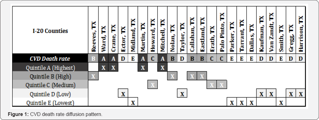
Figure 1 illustrates the diffusion pattern for CVD death rate in the first row, the dependent variable. The five rows that follow below represent quintiles. For each county, the corresponding quintile is highlighted. Smooth variable diffusion is observed between Reeves, TX and Ward, TX; i.e., the change from quintile 'B' to quintile 'A' represents a diffusion of one. Sharp variable diffusion is observed between the counties of Midland, TX and Martin, TX; i. e., the change from quintile 'E' to quintile 'A' represents a diffusion of four. No diffusion is observed between Tarrant, TX and Dallas, TX; i.e., the lack of change represents a variable diffusion of zero.
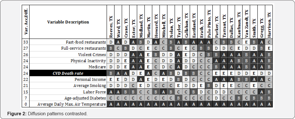
Figure 2 shows the diffusion pattern of 10 independent variables and the CVD death rate. The variables shown are representative to illustrate the different patterns found among the variables. The variables are ranked in descending order based on the accumulated variable diffusion. Due to space constraints, the table with all 60 variables is not presented. The row for CVD death rate is highlighted. The differences and similarities between the dependent variable (CVD) and the independent variables can be expressed in multiple ways when their diffusion patterns are compared. The variable patterns are described and related to CVD (i.e., accumulated diffusion of 24) as follows:


a. Flat line pattern (i.e., does not seem to correspond to CVD death rate because in this region the variable value did not change) such as 'Average Daily Max. Air Temperature', has a constant value across all the boundaries in the study, with an accumulated diffusion of 0.
b. Minimal diffusion pattern (i.e., diffused contrasts with CVD) such as 'Age-adjusted Diabetes', shows a smooth diffusion pattern from West to East while CVD death rate diffusion pattern shows sharp diffusion at multiple boundaries, with an accumulated variable diffusion of seven.
c. Turbulent pattern (i.e., higher accumulated diffusion to CVD) such as 'Fast-food restaurants', shows a diffusion pattern from West to East with more points of diffusion than CVD death rate, with an accumulated variable diffusion of 33.
d. Harmonizing pattern (i.e., sharp diffusion at the same boundaries even in an opposite direction), such as 'Physical Inactivity', with the same accumulated sharp diffusion as CVD death rate.
e. Resonating patterns (i.e., a diffusion pattern that closely resembles CVD death rate), such as 'Personal Income', with an accumulated variable diffusion of 22.
f. Other types of patterns may be seen in different types of data, such as slowing increasing or decreasing or regularity as with a sine wave or Fibonacci sequence. Origin points may also be seen as radiating from a particular locus.
Discussion
The diffusion technique is simple and does not require time consuming statistics. Visualization based on variable diffusion has the following potential applications:
a. Variable Reduction by removing variables that show constant and/or smooth diffusion patterns.
b. Variable Selection by ranking variables by their accumulative diffusion.
c. Variable Filtering by selecting variables within a certain distance from a particular target (dependent variable).
d. Variable Clustering based on diffusion patterns.
Visualization based on variable diffusion may be used to quickly identify variables that could be targeted in interventions. Comparing the variables from a county with high rate of a disease, against those of a county with a low rate may provide the information to select variables more likely to respond faster/ easier to an intervention, in order to impact the rate of the disease.
Clustering based on variable diffusion may be useful for the design of interventions targeting clusters of related variables, in particular, with counties having high rates of disease that might not respond to a single intervention. The variables selected for intervention can be ranked based on resources needed to achieve the goal with priority given to the variable with less resistance to change and requiring less resources to show effectiveness. By inspecting for common variables in counties where cardiovascular disease is high, the factors influencing high CVD can be spotted. Contrastingly, for counties where CVD is low, factors associated with low CVD can be identified. With the visualization contrasting factors associated with high and low rates of CVD, quicker insight as to what kind of intervention may be helpful is possible. For example, origins and sources of disease can be shown plainly on maps of disease spread [17] (Snow, 1854), but what is missing are the accompanying variables that also may be helpful in determining positive interventions. Through the visualization proposed in this paper, medical personnel can be informed quickly of issues occurring in tandem with the particular disease or problem of interest.
Conclusion
Variable Diffusion provides quick visual insight into diseases and their related lifestyle factors in a geographical area, allowing new possibilities to be considered while planning interventions. Feasibility testing shows the value of diffusion as an alternative option for data reduction.
To Know More About Current Research in Diabetes & Obesity
Journal Please click on:
https://juniperpublishers.com/crdoj/index.php
To Know More About Open Access Journals Please click on: https://juniperpublishers.com/index.php


Comments
Post a Comment